Business International
Logo Restyle
A new logo to renew an established company

A new logo to renew an established company
In 2011 the company I work for gave me the assignment to find a new logo, since the one in use was outdated in most of its layers particularly in terms of:
There were some guidelines to follow to keep the brand identity for customers. What could be the best way to represent an old identity, with a brand new style. Solution was found by renewing font and colours, giving the logo a new 3d text effect but leaving the shape of the old one and smoothing the angles.
Year: 2011
Job: Brand Designer
new, cool, mobile inspired
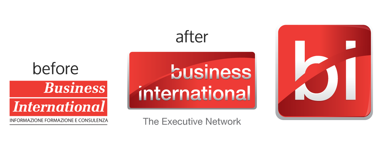
Then i've designed a completely new logo, in its shape and content, inspired by new web and mobile trends. At the moment we've decided to use this version for branding our product, letting people know it, with the idea that it could slowly become our new company logo.